20 years earlier
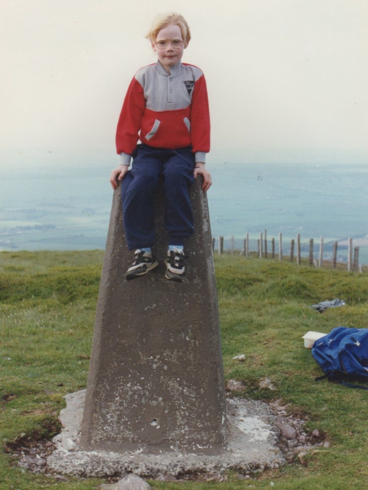
One more fun post to round out the mini-series of Craigrossie-and-Scotland-related stuff. This is me, in the same spot, but about twenty years earlier.
Since 2010
One more fun post to round out the mini-series of Craigrossie-and-Scotland-related stuff. This is me, in the same spot, but about twenty years earlier.
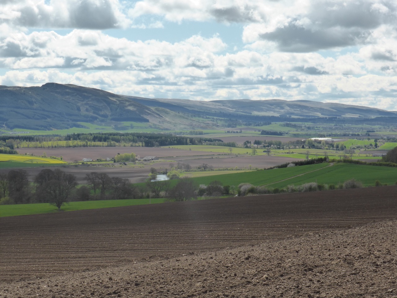
Friends and family often ask what I miss about Scotland. Well, the scenery is pretty special if you ask me. When the sun’s out and the air’s clear, Scotland is stunning from top to bottom.
This photo was taken from the top of Cairnie Braes, and the highest point visible is Craigrossie, which should be a familiar name.
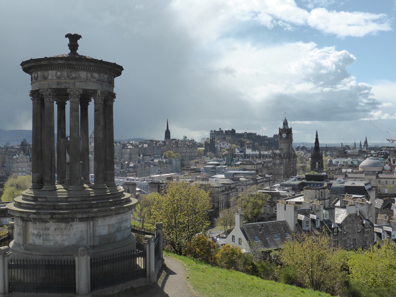
Edinburgh. A random and disorganised collection of very old things, which nobody seems to really know the story behind, and which I don’t find very interesting.
The National Museum of Scotland is awesome though.
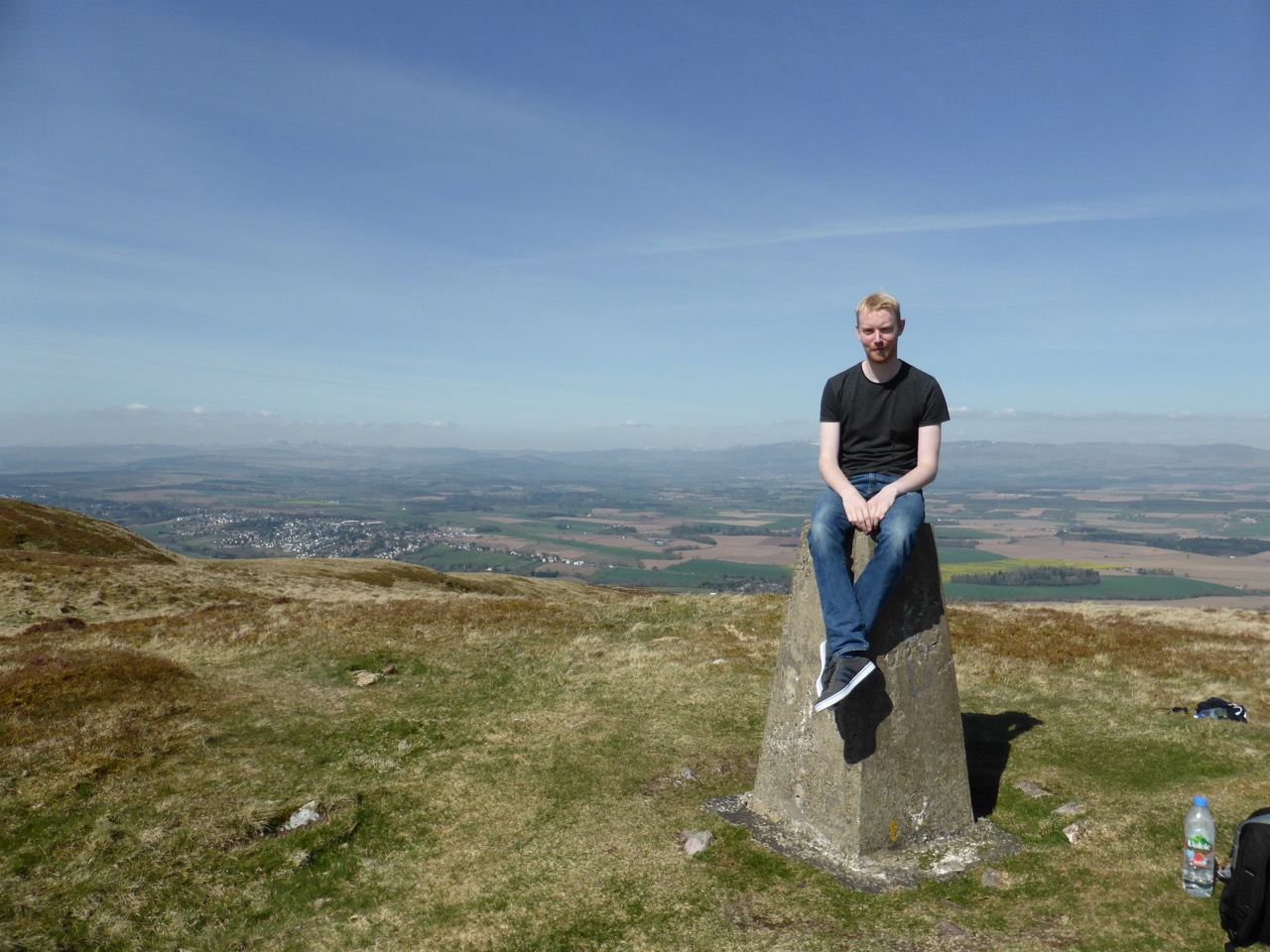
The town I grew up in - Auchterarder, in Scotland - sits on the other side of the Strathearn Valley from Craigrossie. I climbed it the other day for the first time in, ooh, maybe 20 years.
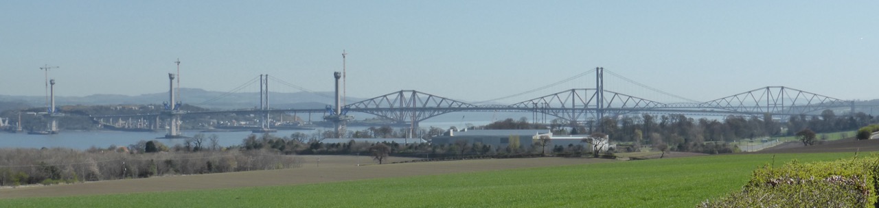
After just 50 years the original Forth Road Bridge is falling apart. The bridge was given an expected lifespan of 120 years when it opened in 1964, but that was calculated under the assumption that the roadway would be carrying just half the traffic that it actually does today.
So a new bridge is being built, called the Queensferry Crossing.
The third bridge in the photo - the one at the back - is the Forth Bridge, which is a rail bridge, and has been there pretty much trouble free for about 130 years. They don’t make them like that any more.