I’m going to have to let my beloved TripView iOS app go. And before I go any further, the problem I’m about to complain about is not the fault of TripView: it’s a classic case of shite-in-shite-out.
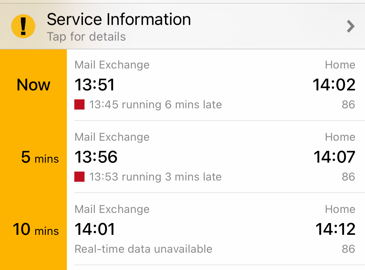
I was in the centre of Melbourne and couldn’t be bothered walking home so I cracked open TripView to see how long I’d have to wait for a route 86 tram to take me home:

Hey there’s one just moments away and if I miss that there’s one 5 minutes behind it. I did miss that first one, but 5 minutes later a route 86 showed up… that was not going to the stop I wanted. It was running a modified route and terminating at Southern Cross Station: 3 stops from where I was, but 6 stops from where I wanted to be.
No drama. The city is busy this weekend with the Grand Prix, and the majority of people were indeed going to Southern Cross Station. You can see that trams weren’t running to schedule either, and it’s pretty common for Yarra Trams to turn some stock around early to help get things moving again when this happens, especially when there are more trams just a few minutes behind.
But the tram behind that one was doing the same.
And the one behind that…
Now I also have the official(?) Yarra Trams “tramTRACKER” app on my iPhone but it’s ugly and it crashes all the time so I only keep it around as a backup. So what was it saying about this situation?
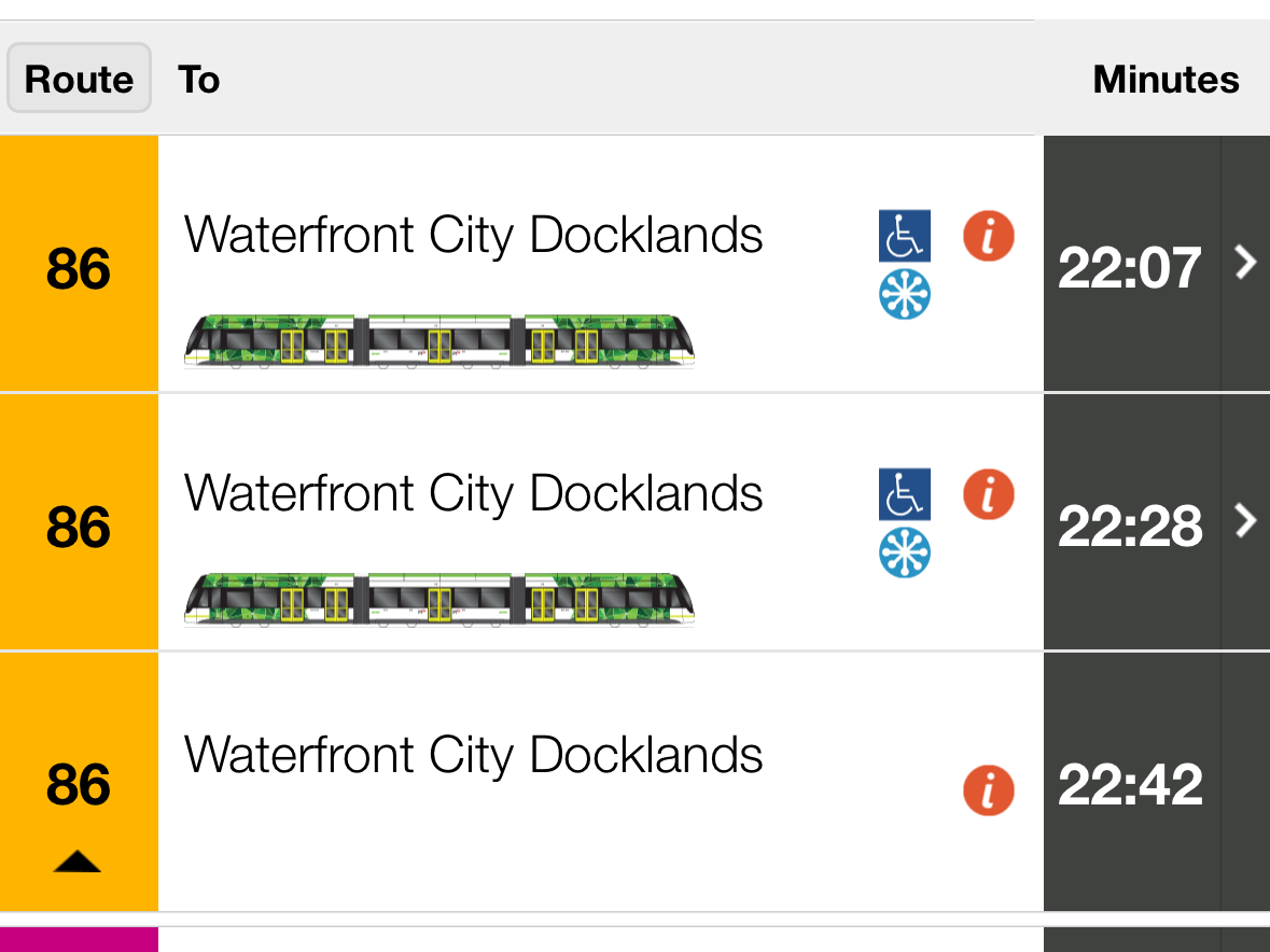
It’s correctly telling me there aren’t any real 86 trams running until 22:07 - 9 hours from the time these screenshots were all taken. I want to be clear I am not complaining about the service changes - there’s a big event in town and things have to be moved around to accommodate it, but by this point I’d waited 15 minutes and watched 3 trams go past because the information I was being fed was crap. There were plenty of transport options available to me, but we can only make decisions based on the information we have, right?
So where was TripView’s crap information coming from? Why the Victorian State Governments Public Transport department!
For the rest of this rant pretend, please, that you’re a visitor to Melbourne who doesn’t want to install a fucking app just to get tram times, and you’ve done the obvious thing by pointing your browser at ptv.vic.gov.au. (By this time I’d walked to Southern Cross Station.)

(Round of applause for the “Feedback” and chat shit covering up the information everyone goes to this site for, by the way.)
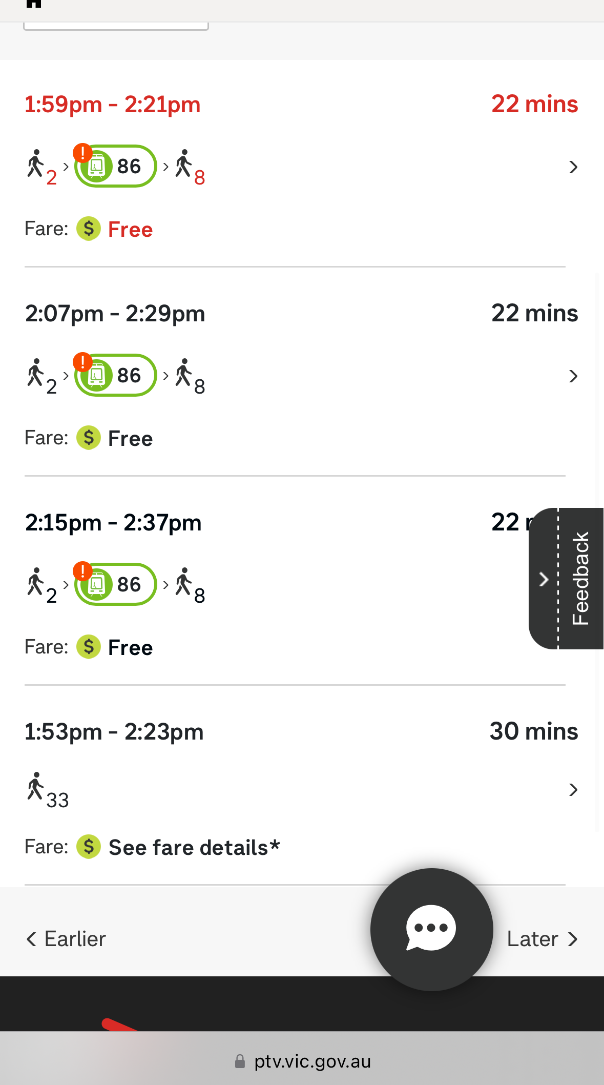
So PTV, who you’d think would be the canonical source of truth for all things public transport, are clueless about the route changes and are telling me it’s a ~20 minute journey based on the start and end points I gave it. Ah but what’s the wee red exclamation mark over the tram icon? Let’s crack open that top journey and see:

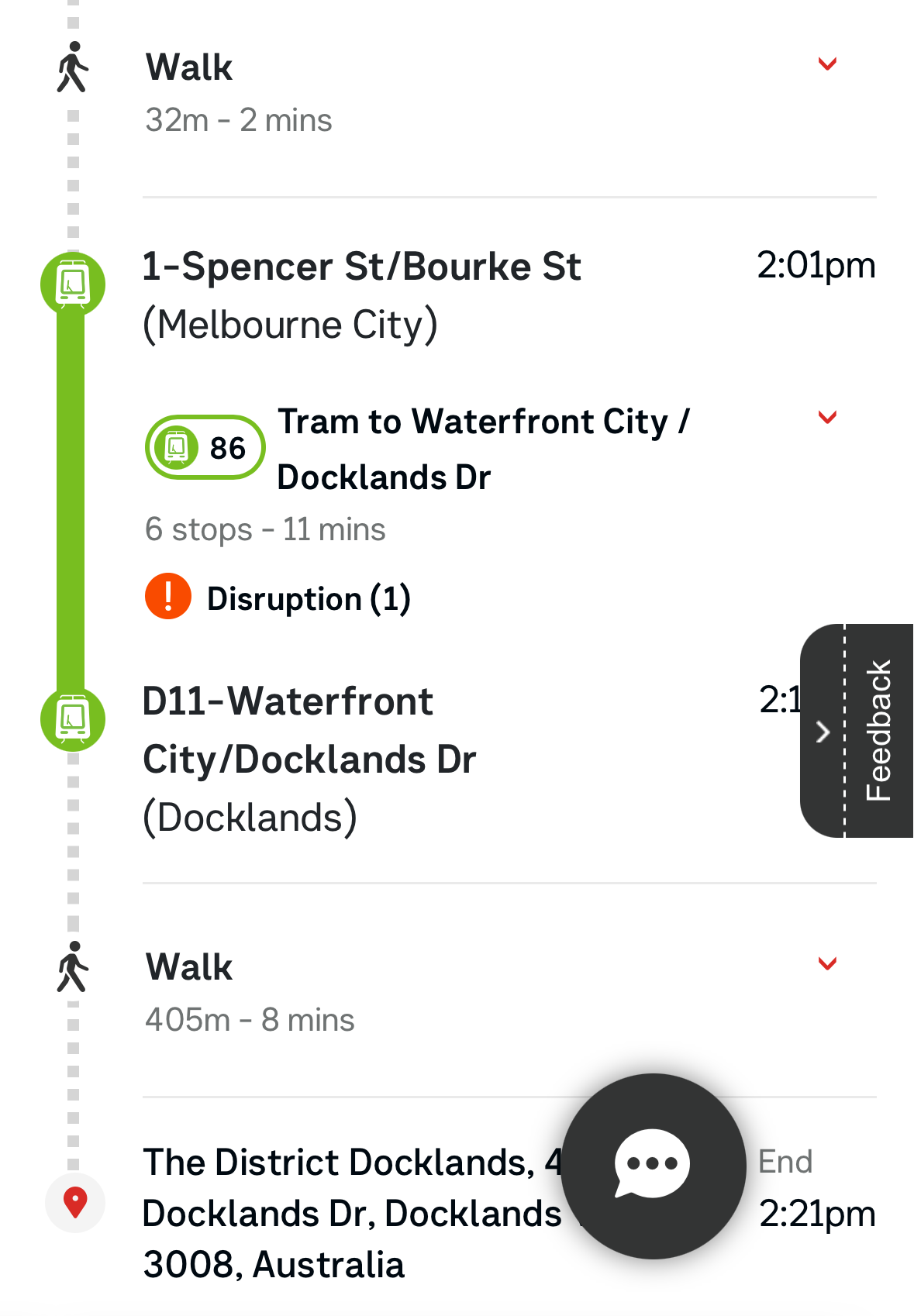
Well okay there’s a disruption, but it clearly looks like I can hop on a tram and 6 stops/11 minutes later I’ll be where I want to be. Which is a lie. Let’s drill down in to that “Disruption” thing again:

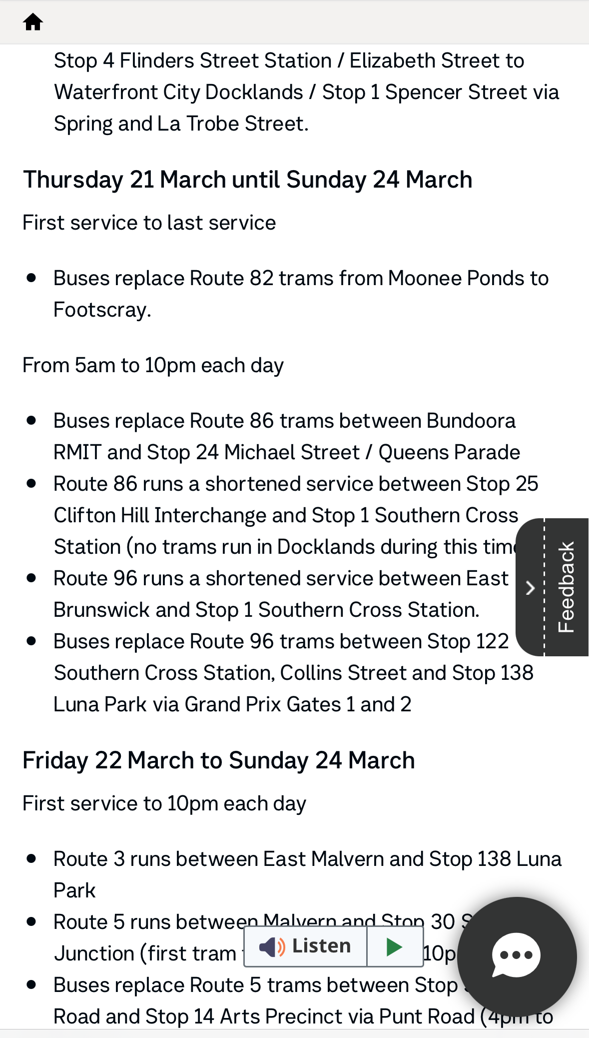
And there it is. Buried in a wall of text and partly obscured by that fucking “Feedback” thing, we discover what we’ve known for 5 paragraphs: route 86 trams are not running in Docklands between 05:00 and 22:00.
Why doesn’t PTV’s journey planner know about this (and in turn TripView)? What’s the point of having an otherwise pretty cool “where are you and where do you want to be” service that returns shit? Bad information is often worse than no information at all! And why are there multiple sources for the same information? And who do I write to to ask what’s being done about stuff like this? It’s embarrassing, just like myki, and the messaging about our awesome free tram zone, and the definition of other zones.
